How to Create a Simple Monthly Budget Layout
In today’s post, I will show you how you can set up a simple monthly budget layout in your budget planner using only Mildliners and a pen.
The planner that I am using is the Erin Condren 8.5″×11″ monthly deluxe planner. It features a calendar and note pages for every month of the year. Here are more details on Setting up a Budget Planner and Budget Planner Page Ideas.
If you are interested in purchasing the same Planner and are new to Erin Condren, you can use my affiliate link to receive $10 off your first order. I will also receive $10 off my next order.
Here is an example of how you can set up your budget planner using only a pen and highlighter and still make it pretty and functional. No washi tape or sticker kits are needed.

I thought it would be a great idea to try to set up my next month’s budget using just my Mildliners and a black pen. This is a simple and inexpensive way to manage your budget and still looks nice and is functional.
*** This post contains affiliate links. By purchasing an item through an affiliate link, I earn a small commission at no extra cost to you. ***
Budget Layout
The main parts of the budget layout are Income and Expenses and budgeted and actual amounts. At the start of the month, you estimate how much money you will receive and what your expenses will be. The main goal here is not to spend more than you earn and have some money left over to put towards your savings.
To help to estimate your expenses, they are further broken down into fixed expenses, which would be your monthly bills and variable expenses. Variable expenses are, to a certain degree, dependent on you. You can spend the bare minimum or more than you have using credit cards or loans.
I have further broken down these variable expenses into living expenses, which are necessary expenses (like groceries), and other expenses that you don’t really have to spend money on (entertainment). This will help you manage your spending a bit more consciously and curb some unnecessary spending if you want to use more money to pay down debt or increase your savings.
Simple Budget Layout – Page 1
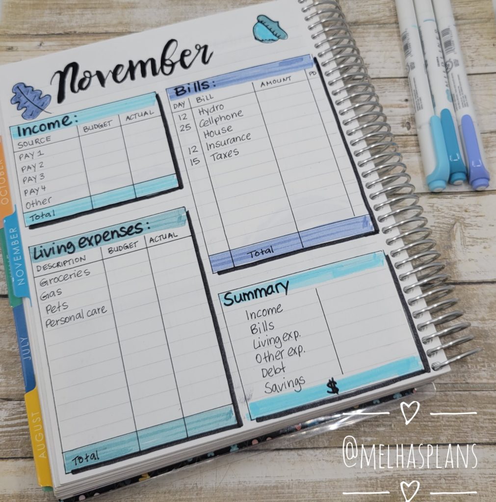
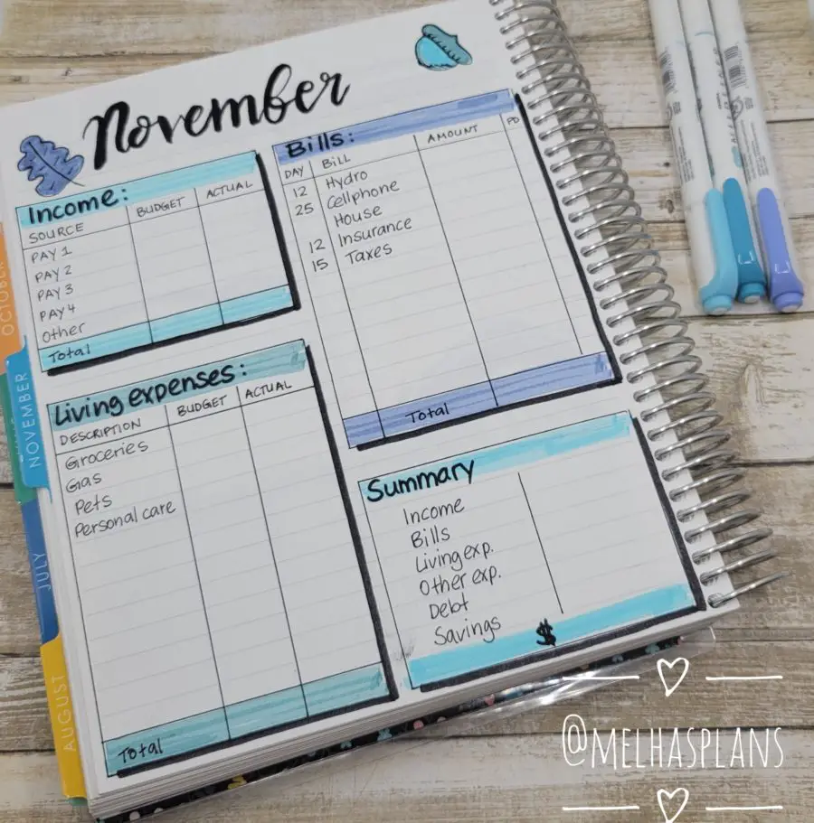
On the first page of my Budget layout, I created 4 categories. The categories are Income, Bills, Living expenses, and a Summary. For the Income and Living expenses, I made a column for budgeted amounts and actual amounts. I don’t think this is necessary for the fixed expenses as exact amounts are usually known before the month starts. Many of the fixed expenses are the same reoccurring amounts like your Netflix subscription, care payment, or rent. Hydro Bill amounts could vary depending on usage but you will receive a bill ahead of time, so you know the exact amount that is due.
I have included a little summary on this page as well. It just shows you a quick overview of how the money is distributed. The way I do my budgets, the total amount at the bottom would be a 0. Any extra money that I have will be allocated to either debt or savings, so there’s never actually any money left over.

Simple Budget Layout – Page 2
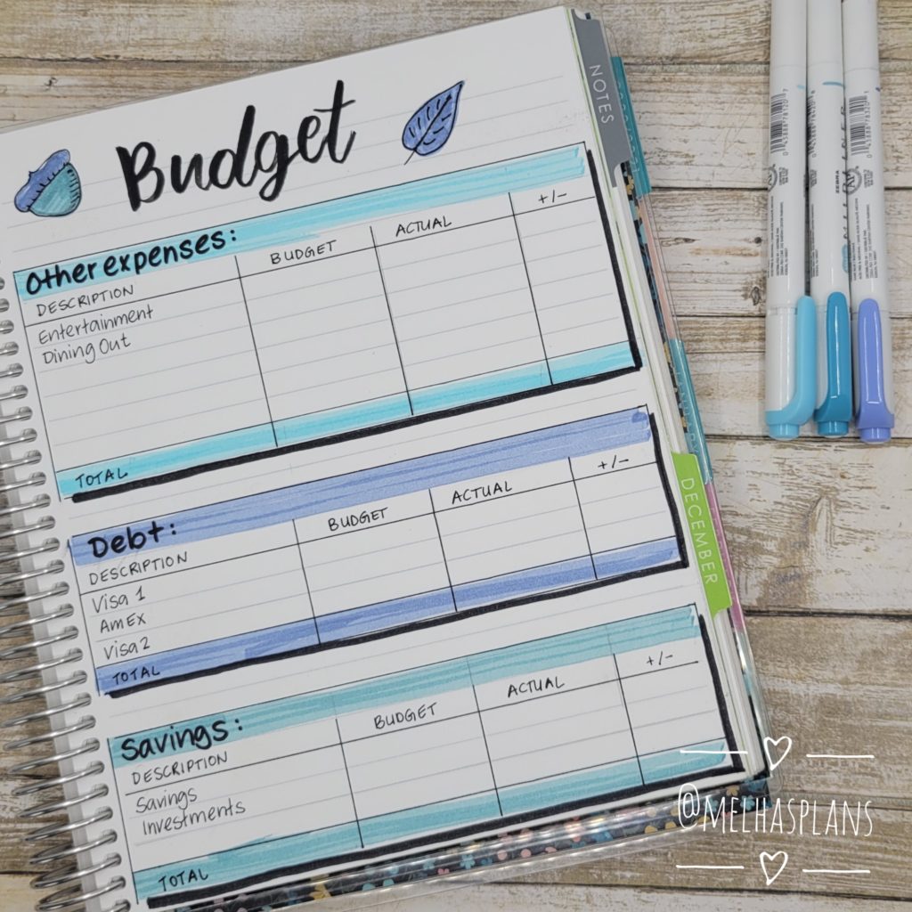
The second page of my budget layout is for the other expenses, debt payments, and savings. As I mentioned earlier, the other expenses are expenses that are not necessary. For me, that would be, dining out, movie theatres/concerts, planner stuff, and gardening supplies 🙂
Some items like clothing and personal care can fall in the living expenses category as well as the other expenses category.
Items used
The items that I used for this layout are:
I hope you liked my budget layouts. Let me know in the comments if you have any questions or would like to see some more budget layouts.
Please subscribe to my newsletter below if you want to get notified when new posts are published. Thanks so much!

